Changing Political Views: Visualisation
As part of a group project, my partner and I created an interactive visualisation that attempts to show how political views in Europe have changed over the last twenty years, and how some of these changes are correlated with major world events.
You can view the visualisation here: https://www.jbm.fyi/ess/.
The dataset used is the European Social Survey (ESS). The ESS is an is a cross-border academic survey conducted across Europe. Every two years, around 40,000 interviews are carried out face-to-face across a cross-sectional sample of European citizens. This visualisation aims to show visually how world events have affected the political views of Europeans over the last 20 years and uses data from all 9 rounds of the ESS. The world events were manually selected from the Wikipedia article: Timeline of the 21st century.
My primary focus was the implementation of the visualisation including processing the data; whilst my partner focused on the design of the visualisation and also wrote a short paper on the insights that could be gleamed from the dataset. The only external library used by the implementation is D3 [6].
The ESS data is imported via two JSON files when the website is first loaded. This data has been processed by a number of Python and JavaScript programs to reduce the amount of computation that must be performed at runtime.
The data processing pipeline begins with a python function that extracts the variables from the 9 CSVs (rounds) that made up the dataset. Next, a second python function analyses the XML documentation accompanying the dataset, finding the numerical-to-textual mapping for each of the variables. A third python function applies the mappings and combine similar columns into a single column (variables have different names in different rounds). The final stage in the data processing pipeline is converting the dataset from a collection of interviews into a collection of averages/percentages across countries and years. This is accomplished through JavaScript functions embedded in a web page, however the functions could be easily called on a node.js based backend for further automation. The output from this final stage were 2 JSON files can could be loaded directly by the visualisation.
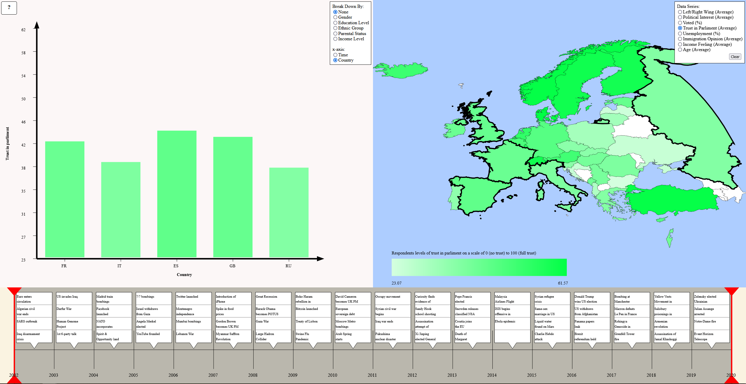
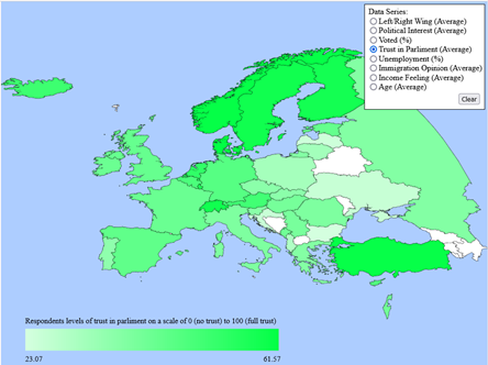
The map section of the visualisation is implemented as a HTML canvas using JavaScript/D3 to render the information found in a GeoJSON file. GeoJSON files contain latitude and longitude co-ordinates for a number of countries with instructions on how to draw polygons representing each country. We used a modified copy of europe.geojson [1] as the base for our map. The implementation is loosely based on the geoContains example found on the d3indepth.com website [2]. Using event handlers, we were then able to determine when a country had been clicked, and therefore what countries our data should be filtered by. A country’s name and exact value (determined by the selected data series) are shown when the user hovers over it, in order to aid in selection. A saturation gradient is used to represent an attribute. Figure 1 shows the completed map implementation.
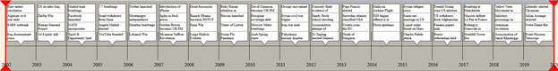
A timeline slider was implemented to both allow the user to filter by year, and also to display major world events that happened during each year. The data for the timeline is taken from a CSV that was manually populated with the most interesting world events from Wikipedia [5]. The slider is implemented as an SVG with event handlers allowing the indicators to be moved to adjust the year range. Figure 2 shows the completed timeline slider.
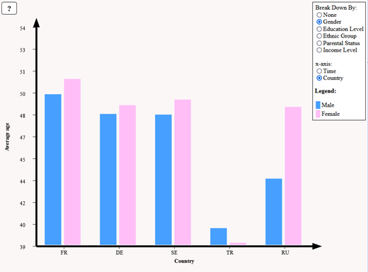
The bar chart area is also implemented as an SVG. The axes are drawn as arrows based on an example by The New Code [3]. The data to be plotted is determined by the selected data series, selected countries and time range. The x-axis of the bar chart can be set to either countries or years. If countries are selected, country code is used instead of full country name. The mapping between country and code is provided by a second CSV [4]. The data can be further broken down into a number of categories such as gender. If the “none” option is selected, the bars are coloured according to the same gradient as on the map. Otherwise, colour is used to indicate which category the bar belongs to and a legend is provided. D3 is used to calculate scaled sizes for the bars and, using event handlers, a tooltip showing the bar category and exact value is shown on the bottom left of the screen to help users obtain precise measurements. The implemented bar chart is shown in figure 3.
The code for the project is available here: https://git.jbm.fyi/jbm/ESS_Visualisation
[1] https://github.com/leakyMirror/map-of-europe
[2] https://www.d3indepth.com/geographic/
[3] http://thenewcode.com/1068/Making-Arrows-in-SVG
[4] https://datahub.io/core/country-list
[5] https://en.wikipedia.org/wiki/Timeline_of_the_21st_century